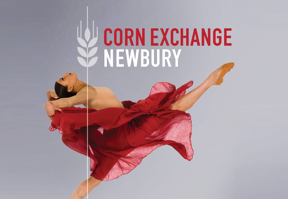

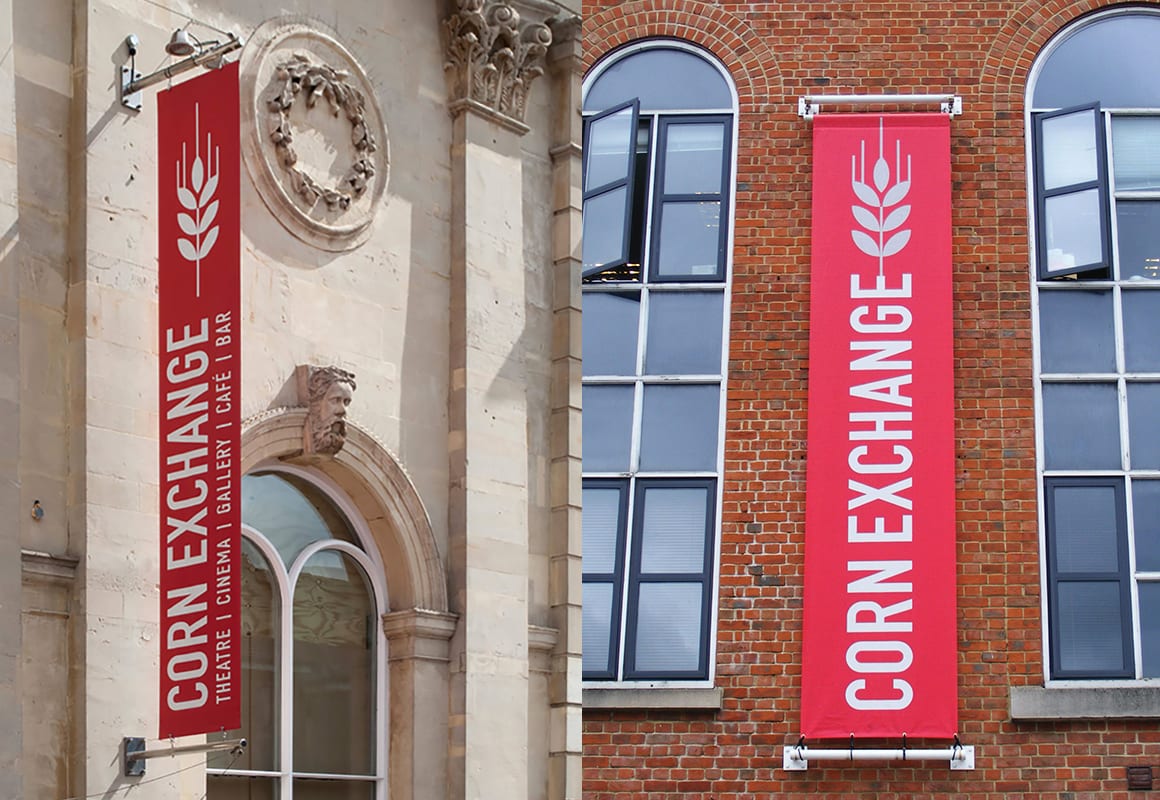
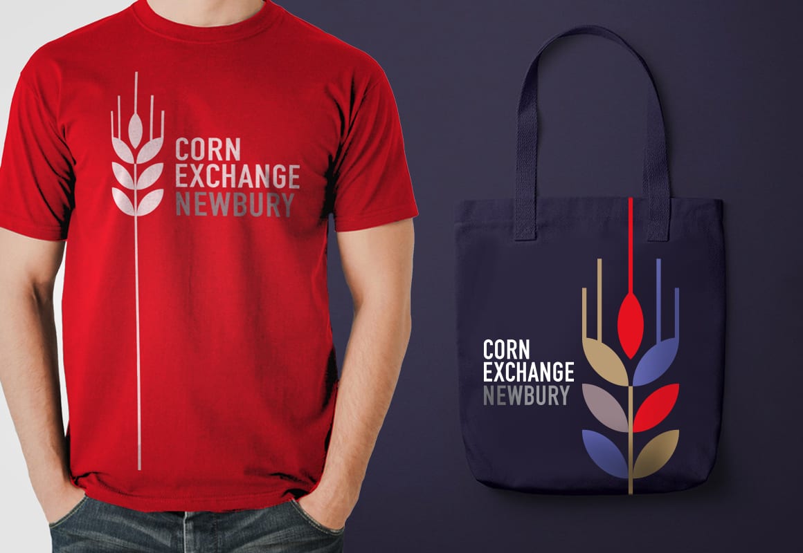
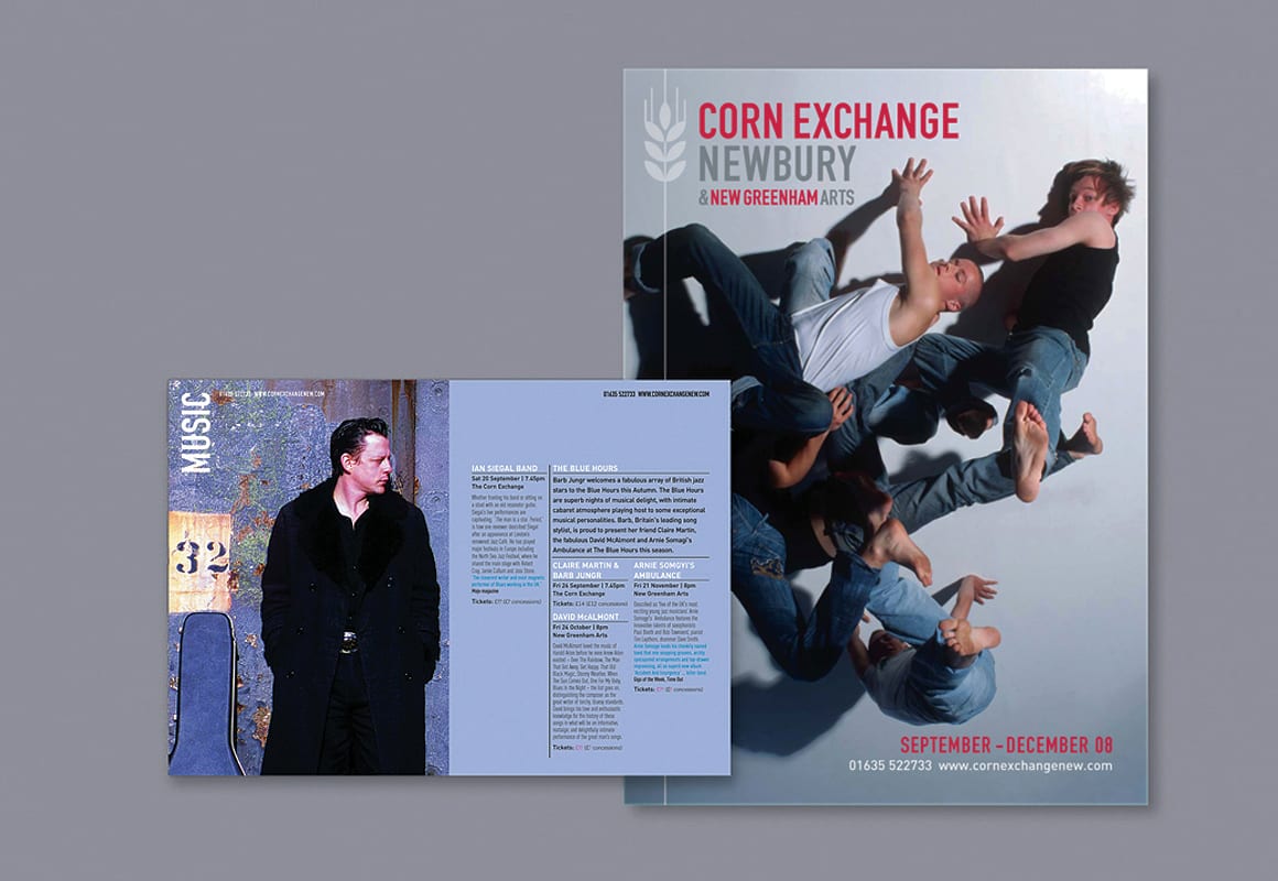
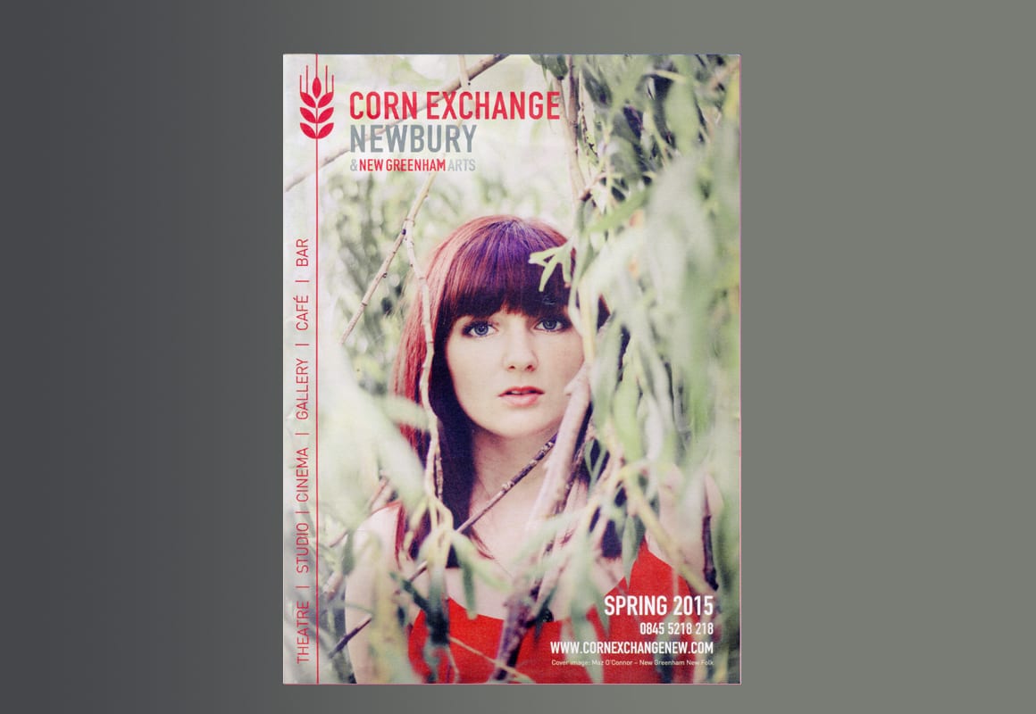
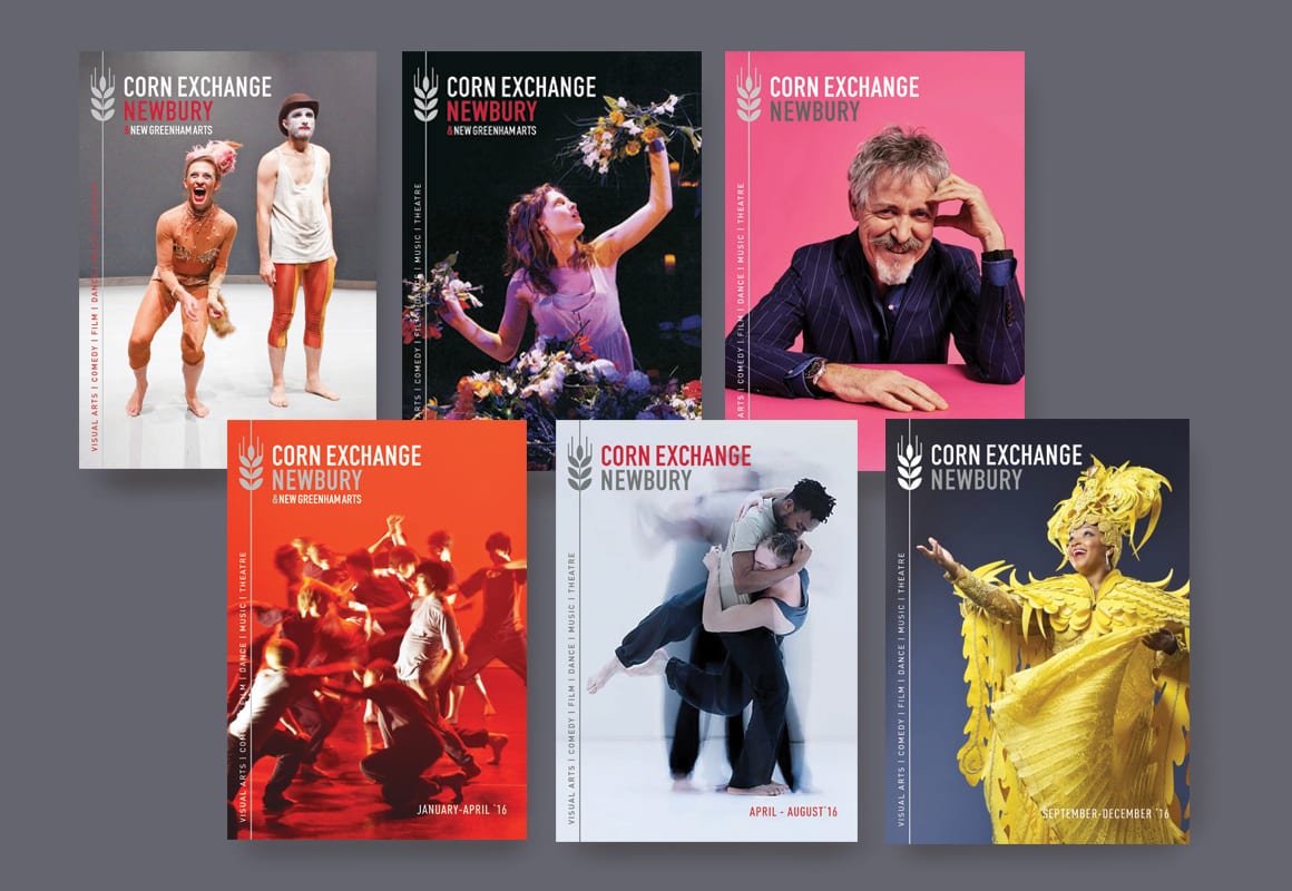
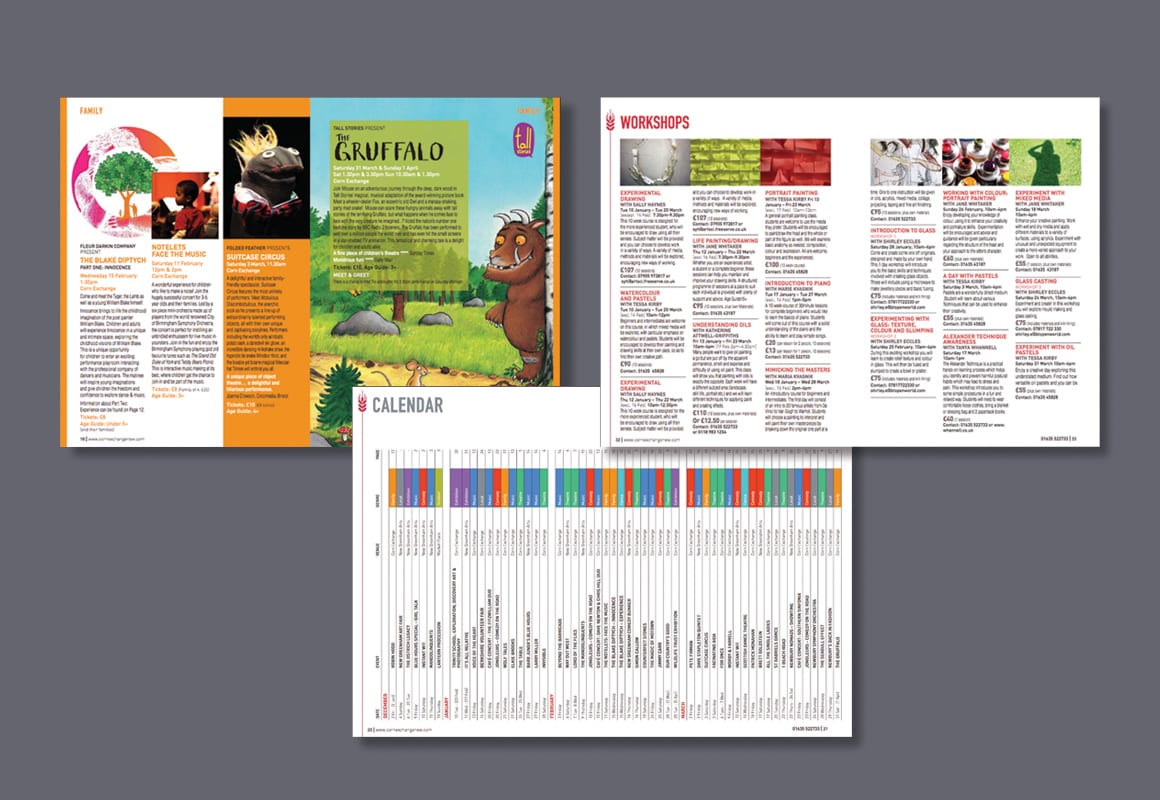
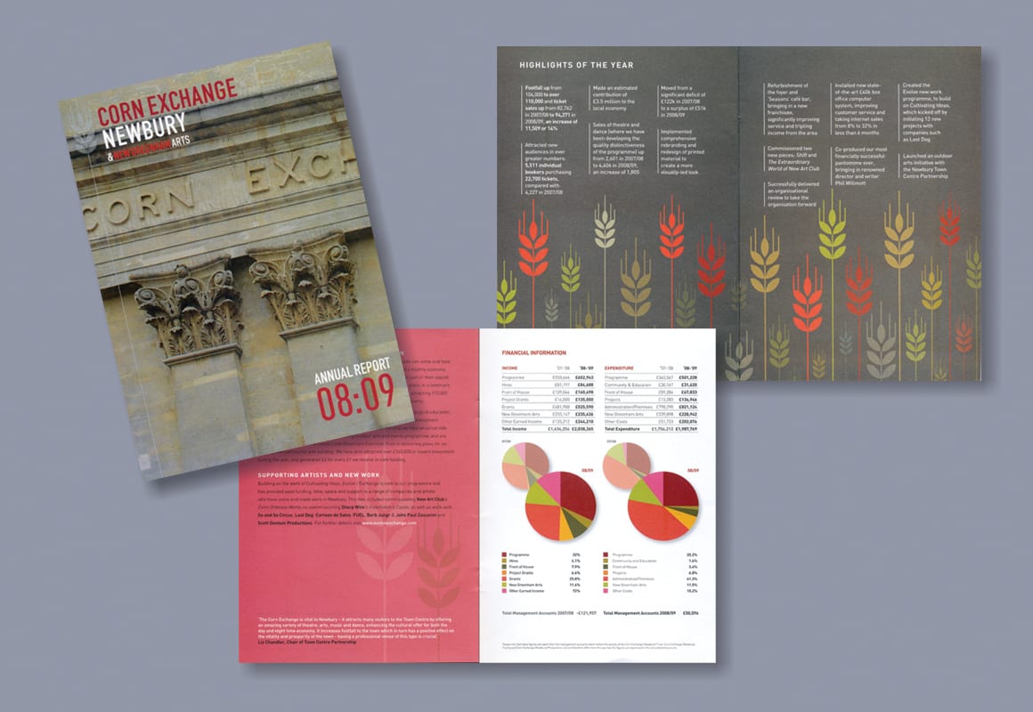
With a new director and a shift in direction at the Corn Exchange, Newbury, Visual Philosophy were asked to overhaul the current branding to project this change towards more adventurous arts programming. The core ‘wheat sheaf’ mark harks back to the building’s original use, but also signified new growth and direction, and provided a useful graphic motif to be played with across branded materials. The rebrand included developing new literature, updating the website and creating new internal and external signage.


2020 VisualPhilosophy Design