
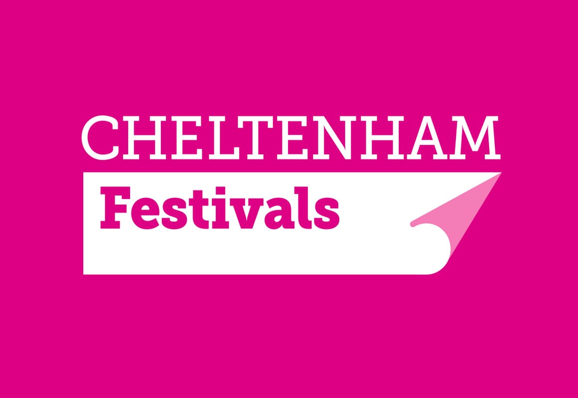
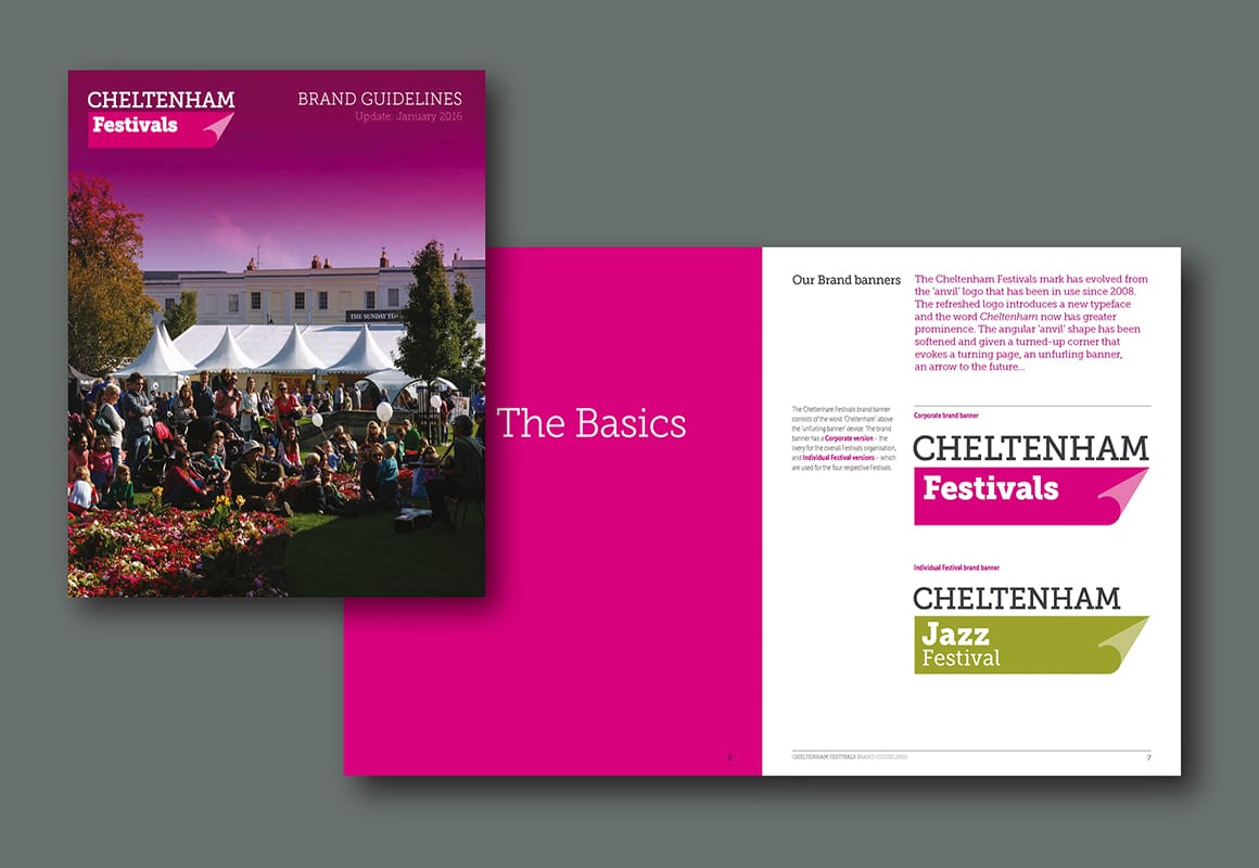
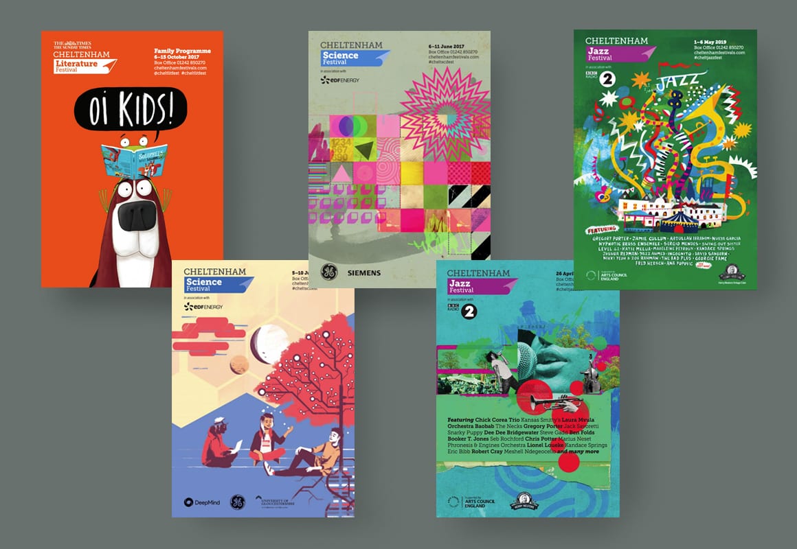

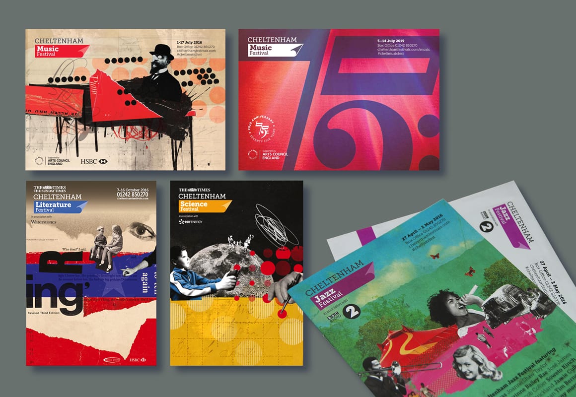
Cheltenham Festivals’ identity had served the organisation well for over a decade, although an inevitable ‘slackening’ of rules and multi-agency interpretations of the brand had led to a somewhat anarchic feel to communications. A new strategic direction to bring the four festivals closer together, along with the shift in communications from largely analogue to largely digital, made it timely for a review and a refresh of the branding. Our brief was to evolve the current ‘anvil’ logo (while not straying too far – the brand had strong recognition, and the wealth of existing materials made a complete rethink impractical), to update typography and to draw up guidelines for a graphic language that could be used consistently across the organisation and unify the look of all Festival communications.
Our ‘unfurling’ banner (with its allusions to turning pages, new experiences, the showcasing of new talent and cutting-edge programming) was paired with a new font family that provided the flexibility for changes in mood and tone according to different audiences, while still maintaining a strong ‘house style’. Our in-depth guidelines provided new rules on colour palettes, typographic protocols, layout principles and guidance on imagery and tone of voice.
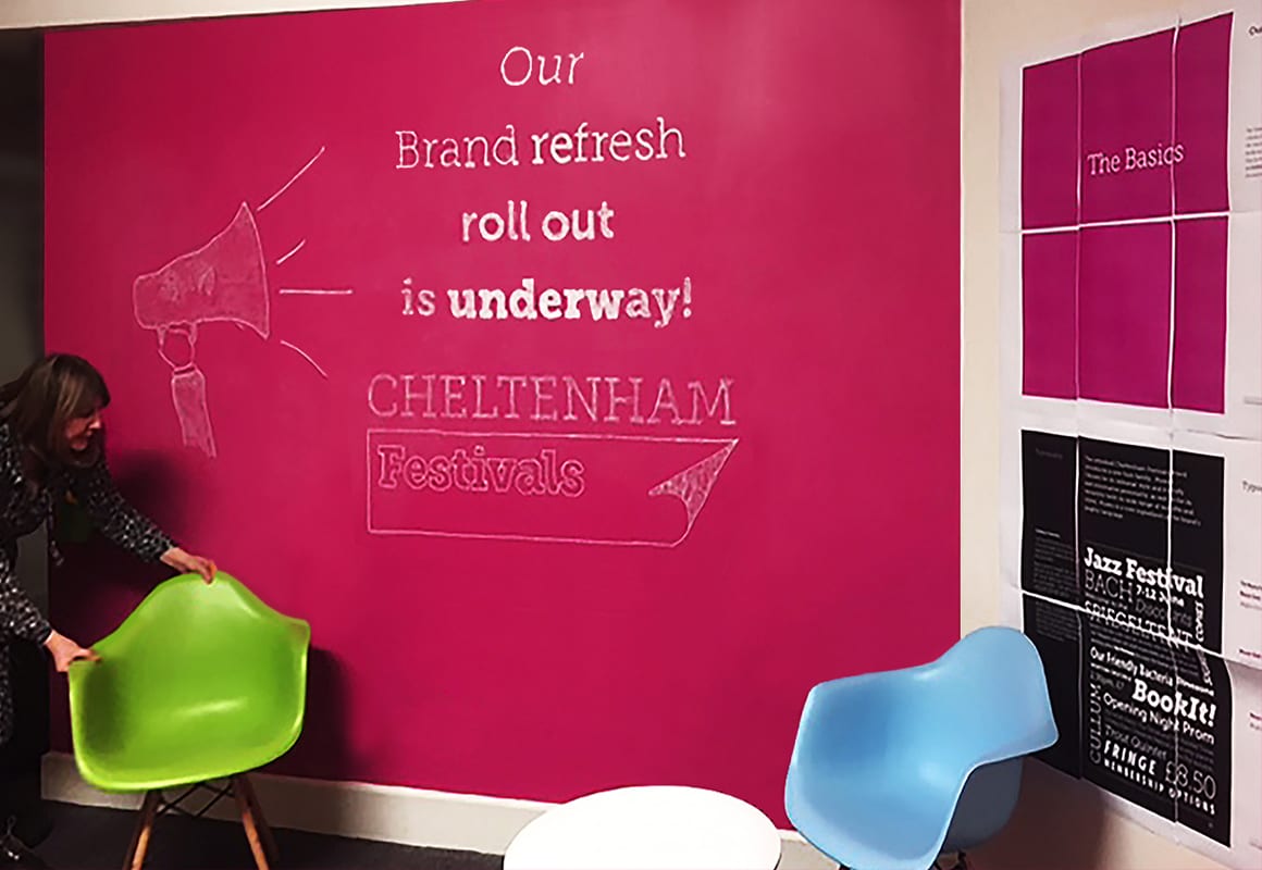
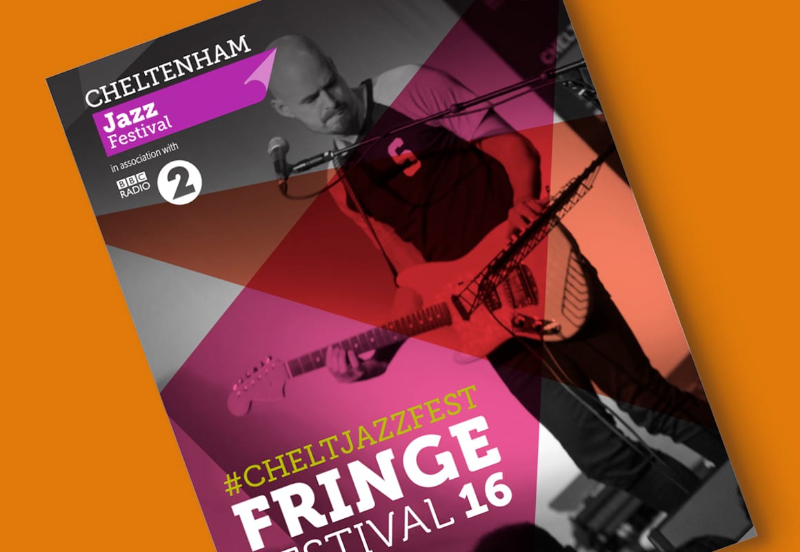
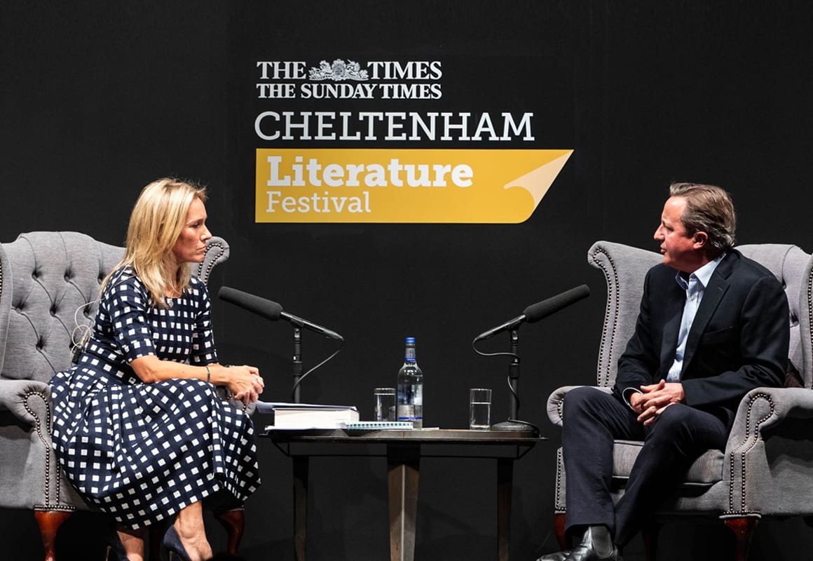
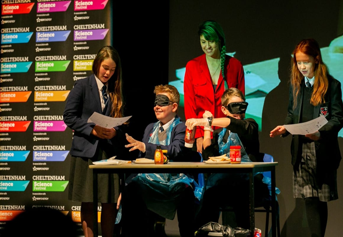
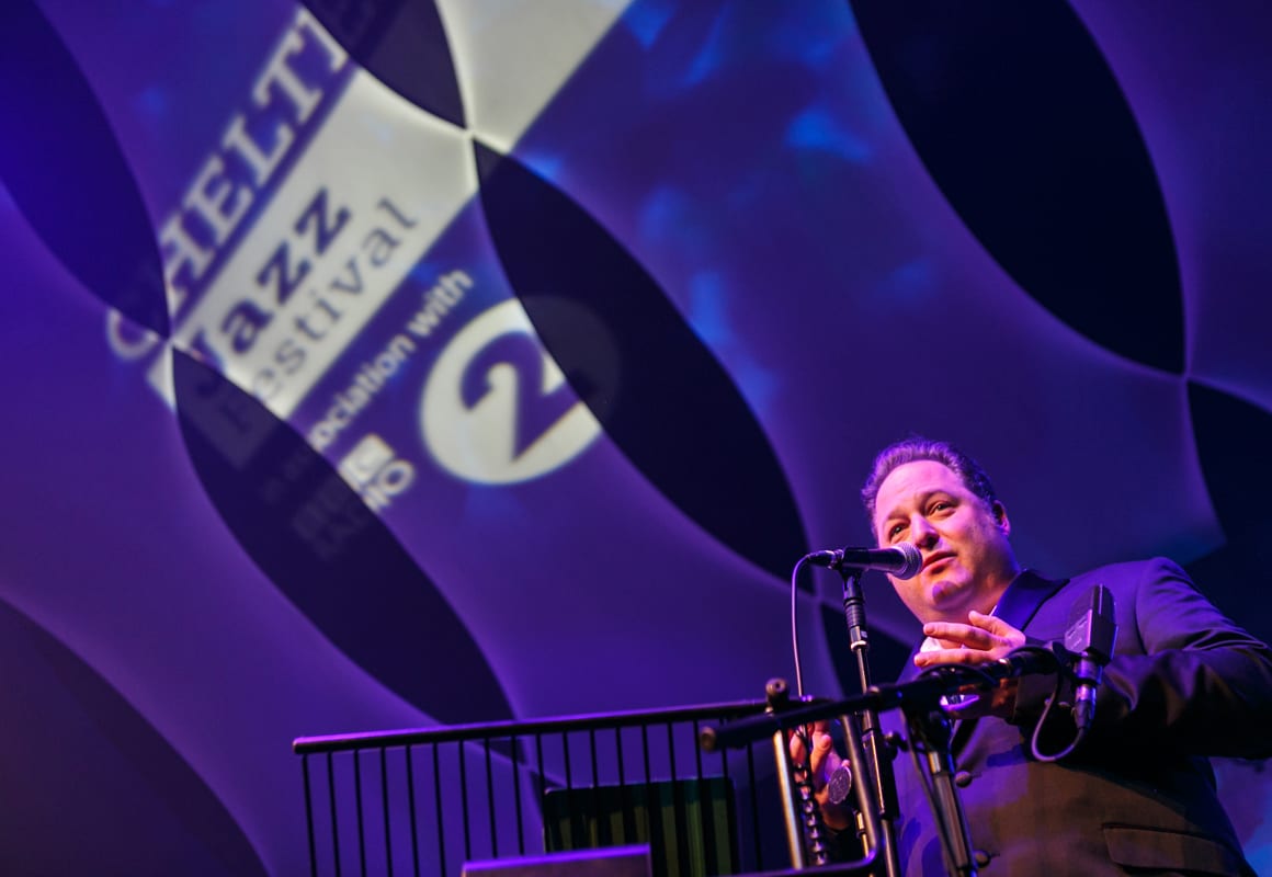
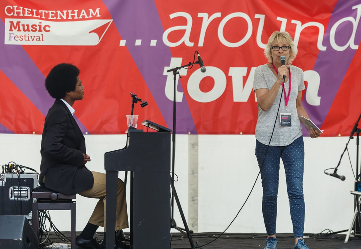
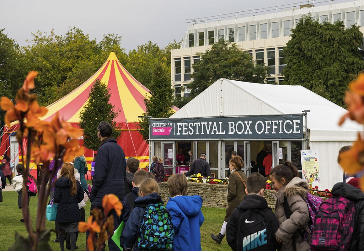
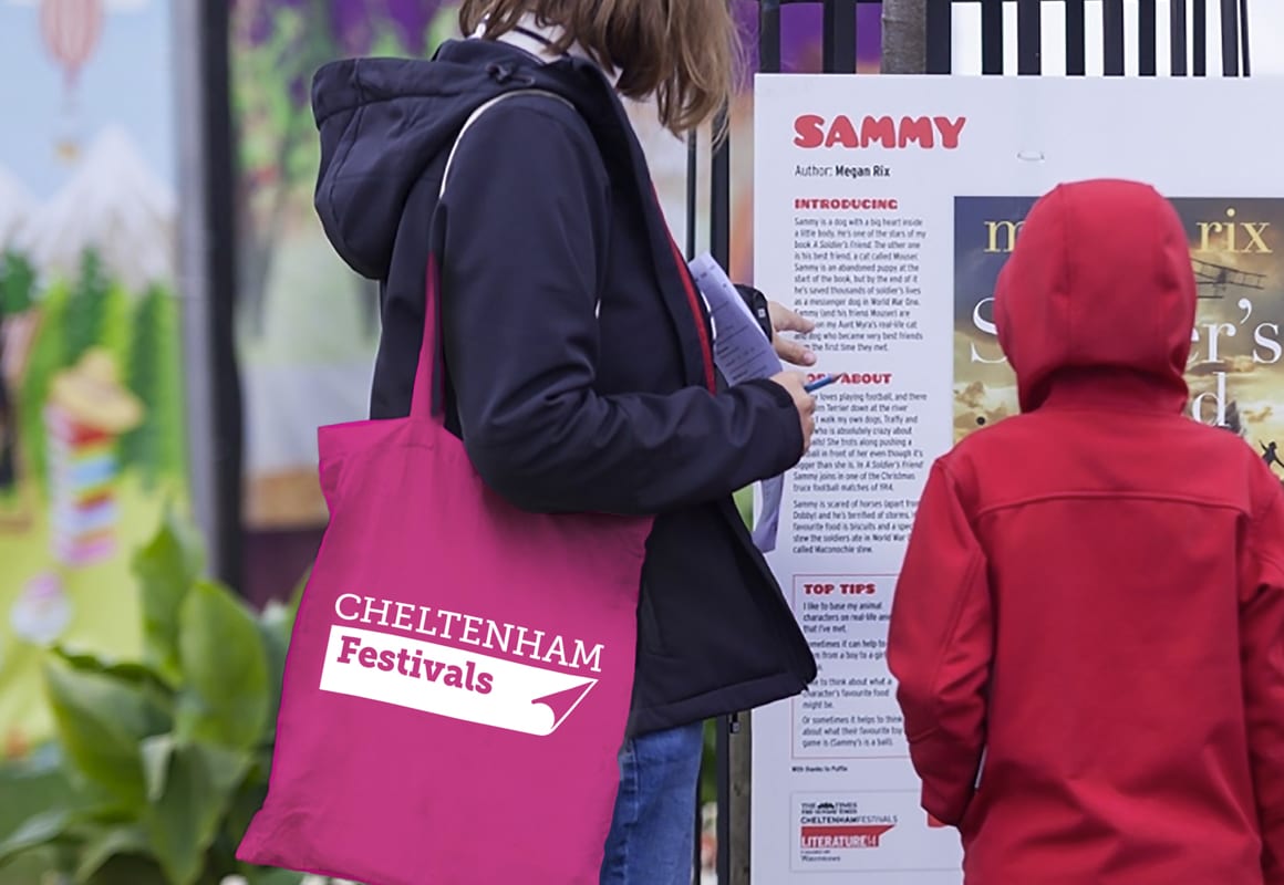
The new identity has been applied to everything from printed programmes, the Festivals’ website, event signage, internal communications and much. much more.